A note from July 2026: since this first ran, Strava locked its API behind a paid subscription. That forced a rebuild around Garmin and the major update you're reading now.
Garmin's web app has every metric you can think of and a UI that makes it nearly impossible to find any of them. Strava is the inverse: a beautiful UI built around what other people did this week, with the metrics I cared about gradually moving behind a paywall. The thing Strava was selling me, segment competition, wasn't the thing I wanted.
So I let the subscription lapse and built my own. It runs as a LaunchAgent on a Mac in my office, pulls new rides on a 30-minute timer, narrates my training day with a local LLM and surfaces the stats I actually care about. It started as a month of evenings and it hasn't stopped growing since. These days it does more than narrate my training. It talks back.
I've been riding forever, and in the past sixteen years I've collected more data than I knew what to do with. A gold mine to learn from. The apps I was using were each only telling me a third of what I wanted to know.
01
What I came for
Three things specifically.
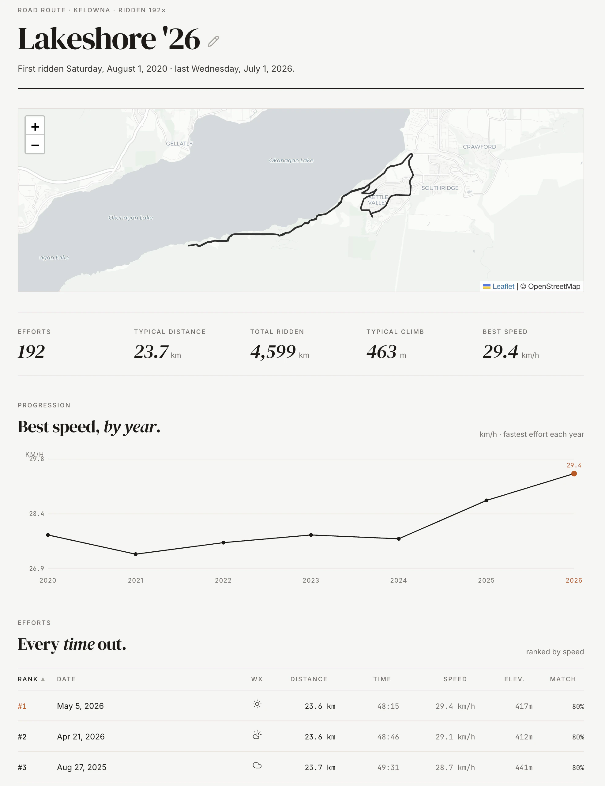
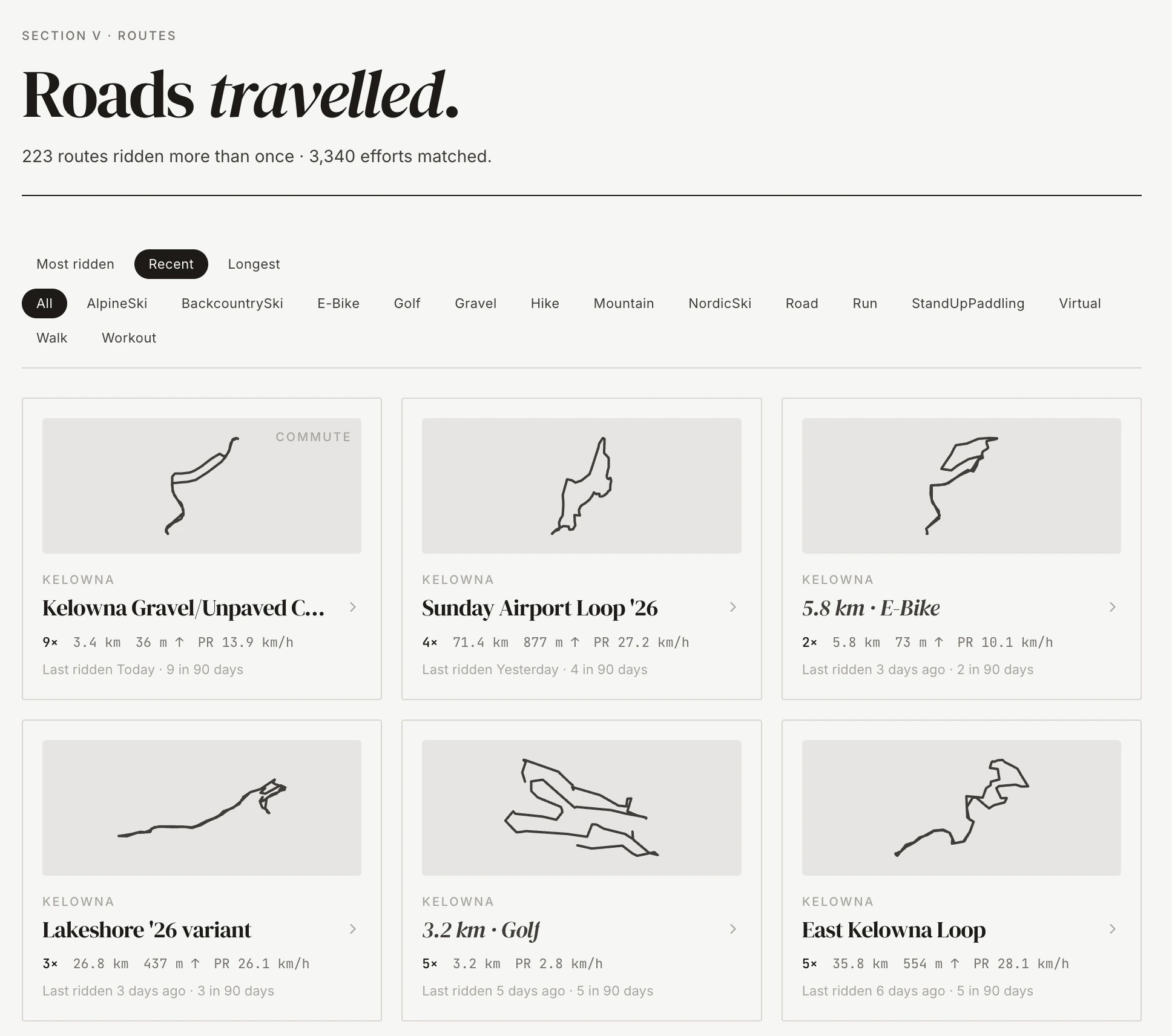
How any ride stacks up against the same ride I've done dozens of times before. Strava ranks segments. I wanted to rank routes, with overlap matched by shape so years of repeat efforts line up against each other. That idea grew into its own page, but it started here, as the first thing I missed.
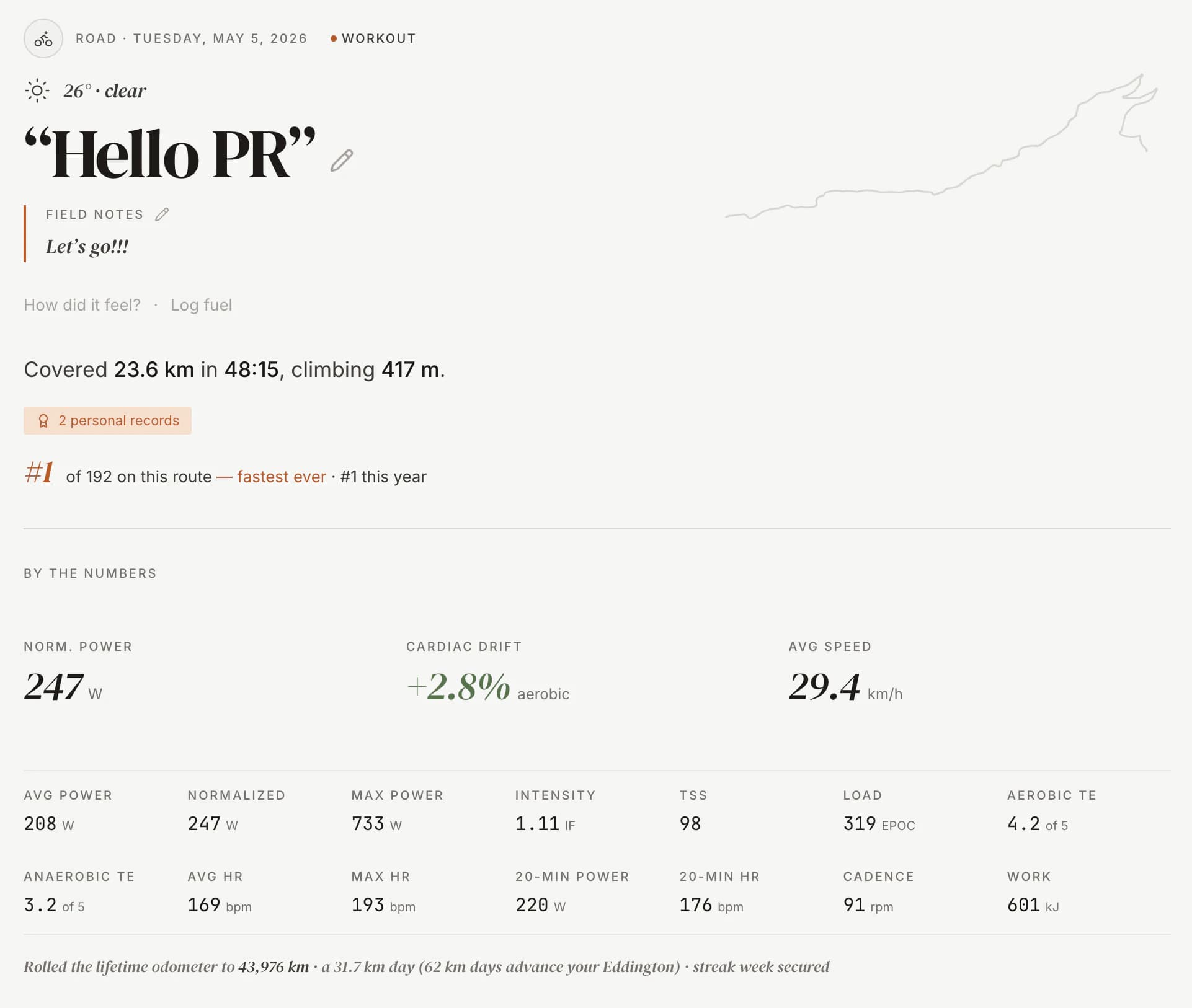
Cardiac drift over the course of a ride. Heart rate climbing while power stays flat is the cost the body is paying to keep the bike moving. Both apps record the signal. Neither charts it. Watching that gap close as fitness comes back is one of the most direct training feedback signals I know.
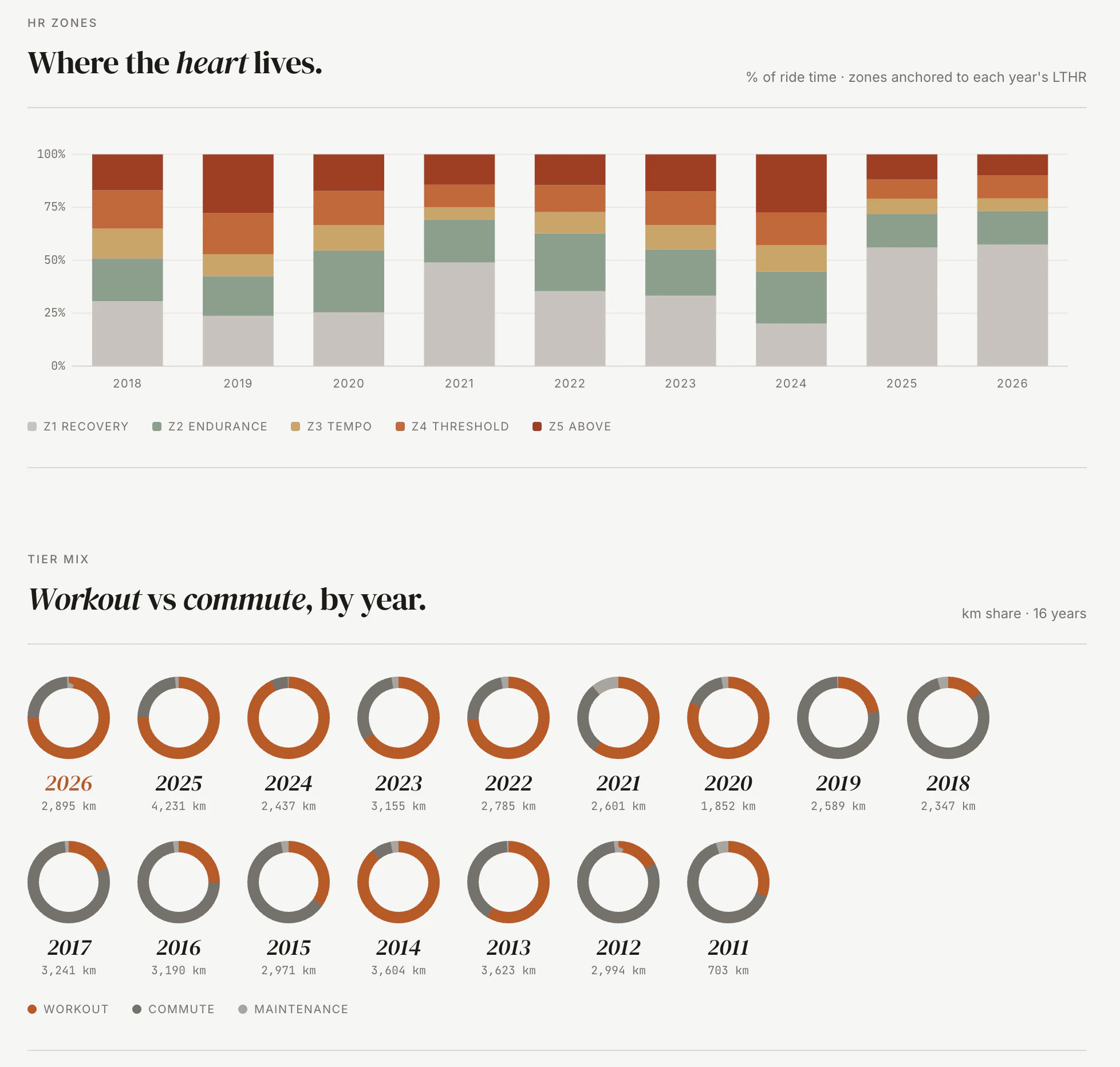
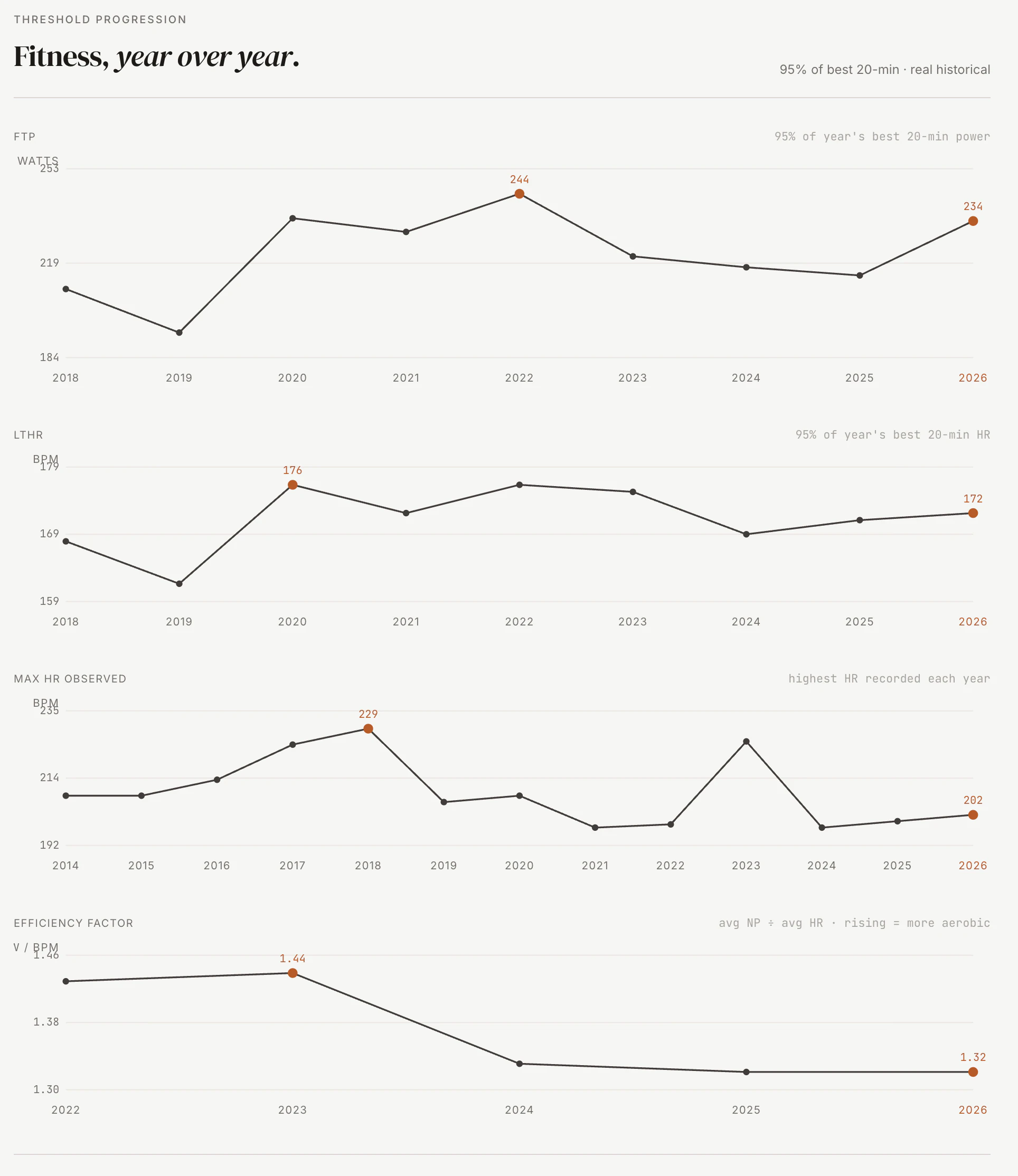
Heart rate over power across years. The same ride at the same wattage at a lower heart rate is fitness. The same ride at the same heart rate at higher wattage is also fitness. Either way the ratio moves, and the chart shows it. Most apps optimize for the last thirty days. Improvement in economy is a slow signal you can't really see ride by ride. You can see it year over year, especially as you get older.
02
What it is
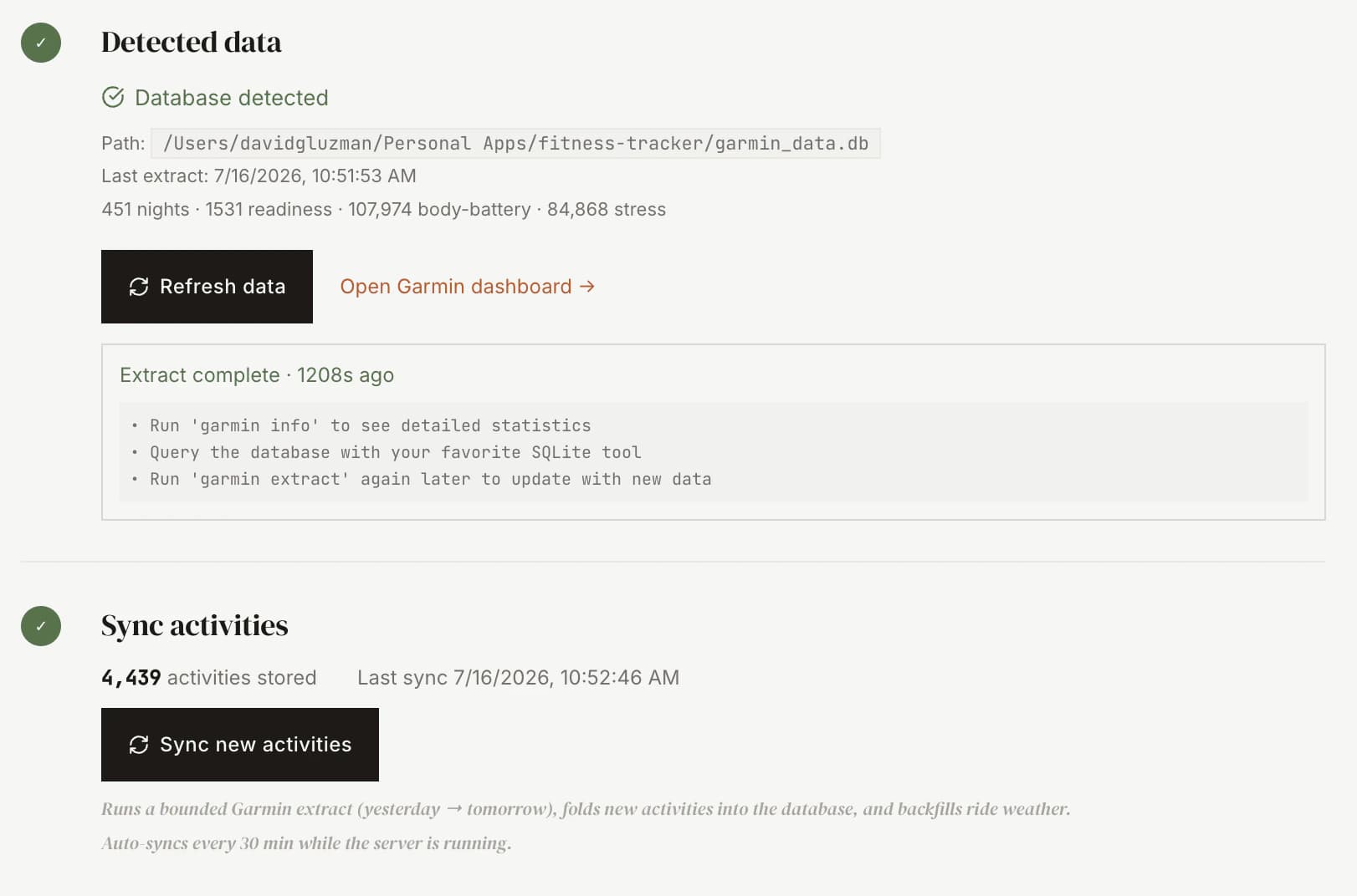
The stack is small. Express backend, React and Vite frontend, SQLite via Prisma for storage. One process, one URL, one machine. A sidecar SQLite from a separate Garmin extraction tool feeds it, no Garmin credentials ever touch my app, and Ollama runs locally for the language model that writes the coach's notes.
Garmin is the spine. It's the source of truth for the activity feed itself and for everything that matters on a ride: heart rate, power, training-effect, recovery, and the route line, which I build from Garmin's own GPS trace at ingest. Strava sits on top as optional garnish. Kudos, descriptions, the occasional ride my Garmin never recorded. When Strava moved API access behind a paid subscription this year, I rebuilt so the app runs fully without it, and by default it does. There's even a path that reads a Strava bulk export with no API at all. Letting that subscription lapse turned out to be load-bearing, not just a preference.
03
The data layer
Most of what makes a fitness tracker useful sits in date math. Garmin auto-resume vs forced-window extracts. Comparable-as-of-date calculations so a year-to-date this year compares to the same calendar day last year. Routes matched across years by shape, not by segment. Commutes auto-tagged from the route signature, no manual labels.
None of that is glamorous. All of it is what makes "check today's ride against the last 90 days" work. There's no AI for that. There's just careful UTC date handling, a few hundred lines of comparable-period math and a willingness to write the boring parts.
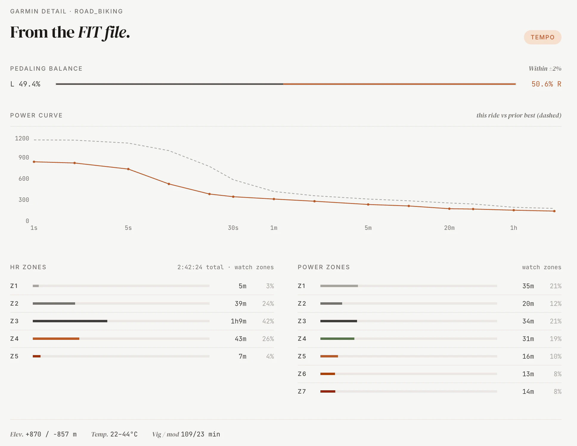
FIT-file detail
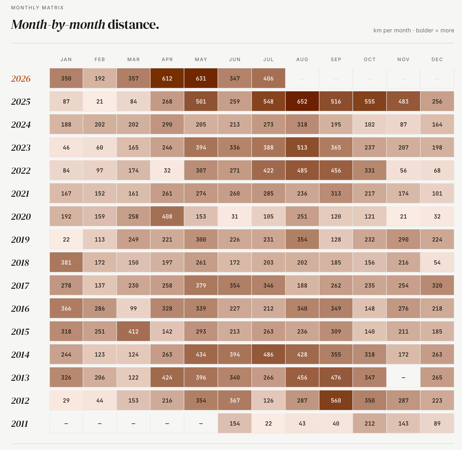
Monthly distance, year over year
Route matching earned its own page. A canonical clustering step folds every GPS trace into the route it belongs to, so a loop I've ridden a hundred times collapses into one entry with a hundred efforts under it, ranked. A corridor-coverage matcher catches the near-misses that never quite overlap. Reverse-geocoded labels name each one, and a lifetime-kilometer tile totals every time I've ever ridden it. It's the first thing I came for, grown up.
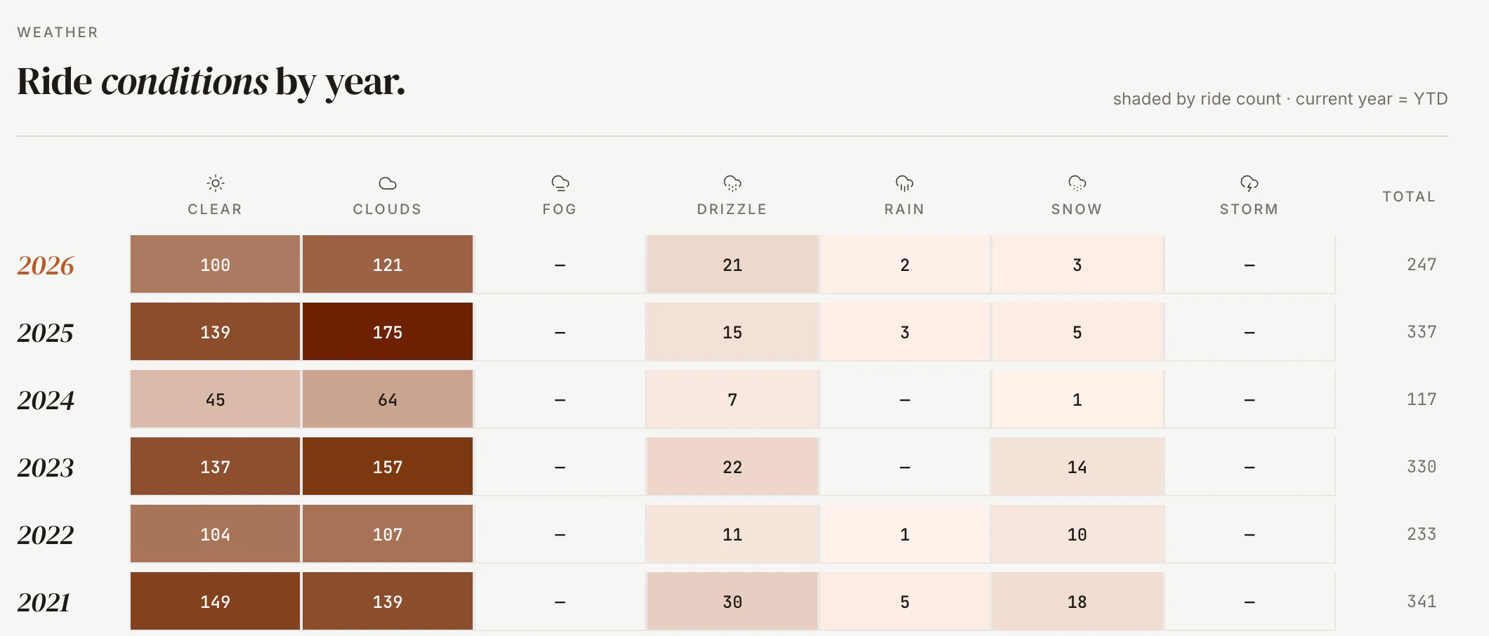
Weather is the third data source. Every ride gets historical weather attached at ingest: temperature, wind, precipitation and humidity, pulled from Open-Meteo's archive for past rides and from the ECCC GEM model forecast for today and tomorrow.
The masthead carries a live weather strip tied to my location. A rolling snapshot that refreshes on every load, shows the day's trend at a glance, and lets me hover any hour to see how the forecast shapes up. Air quality sits next to it. A rideability ribbon underneath flags the best window to be outside.
Weather is critical for planning rides outside and for picking which bike to take. Happy training is good training.
04
The coach
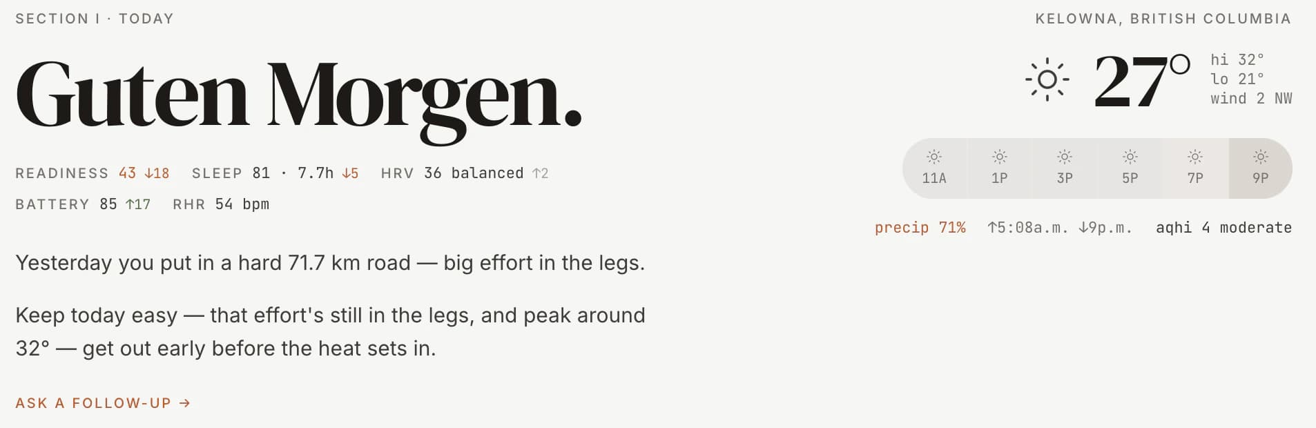
The dashboard greeting is a paragraph generated by a local LLM. The LLM gets a full briefing: yesterday's activities with all metrics, Garmin recovery signals (readiness, sleep, HRV, training load), this week's volume against my four-week baseline, today's weather, and now how recent rides actually felt and what I ate on the bike. It returns a verdict of workout, maintenance or rest, a discipline from a constrained palette of road, gravel, mountain bike, e-MTB, fatbike, trainer, weights and yoga, and a prose sentence that varies with time of day.
If Ollama is down or the LLM returns garbage, a deterministic template takes over. The user never sees a broken state.
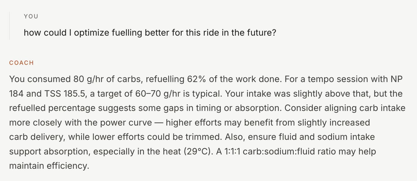
For a while that was all it was: a paragraph I read in the morning and a debrief I read after a ride. Useful, but one-directional. So I gave it a way to answer. The coach's note is now the opening line of a conversation. On the dashboard I can ask why it wants me to rest today. On any ride I can ask what the cardiac drift means or whether I under-fueled. Both threads are seeded with the note the coach already wrote, so the conversation picks up mid-thought instead of starting cold, and both stay grounded in the same signals the note came from. It can't invent a number it wasn't given.
The constraints matter as much as the prompt. Weather doesn't pick the discipline; it sets a mode (open, indoor, timing, forced or rest) and the model picks from the palette inside that. Benign weather leaves the choice open and the LLM has to make an interesting one, not reflexively default to gravel because the prompt mentioned roads.
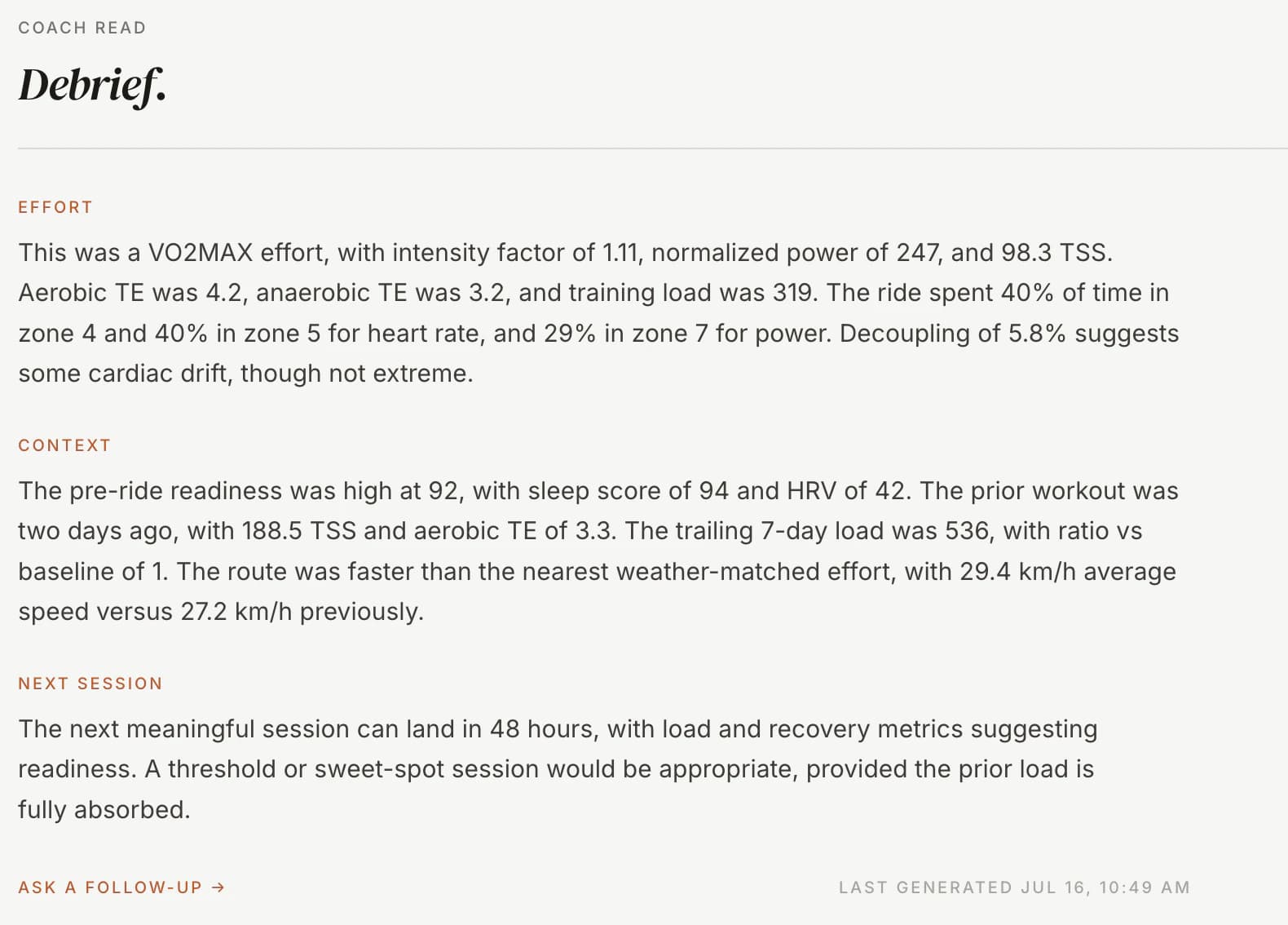
The debrief works the same way. Every completed ride gets its own note, written from that activity's full record, and every note is a door into the same back-and-forth. It's the difference between a coach who leaves a sticky note and one who's still in the room.
05
Fuel and feel
Two things the tracker never used to know: how a ride felt, and what I put in my body while it happened. Both matter to a coach. Neither shows up in a power file. So I taught it both.
Feel is a one-tap rating. Green, amber, red, tapped once when I'm done. It sounds trivial and it's the single most useful field I've added, because the numbers can call a ride easy while my legs disagree, and the coach should hear both. Every coaching surface now reads it.
Fuel took more. It starts with a pantry: every bottle, gel, drink mix and, yes, can of Coke I actually use, each with its carbs, sodium, caffeine and fluid straight off the packet. Plain water is a product too, so logging a ride is always product times servings, never guesswork.
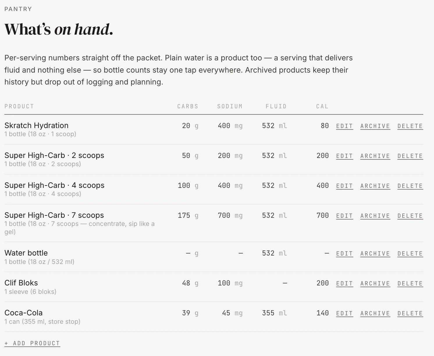
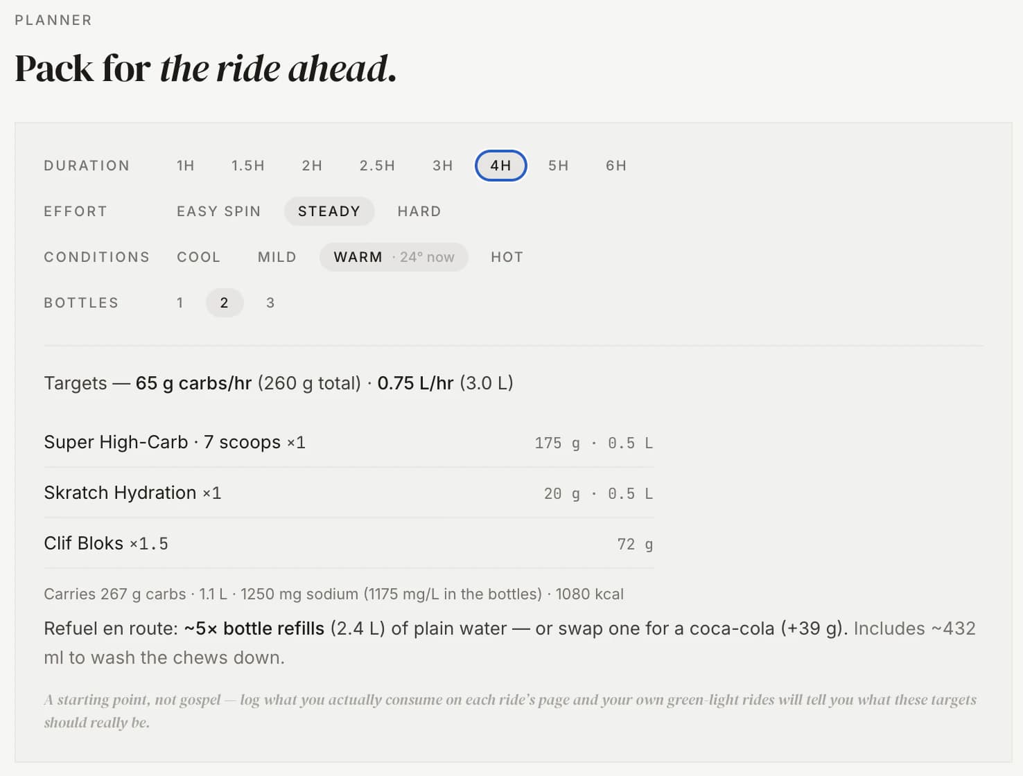
On top of the pantry sits a planner. I give it a duration, an effort and the day's conditions, and it works out the carb and fluid targets, then packs a loadout from what's in the pantry: two bottle cages, a plan for water-or-coke refills, one plain bottle held back per carry. It reads sodium in milligrams per liter and raises a quiet flag when a hot forecast meets a low-sodium plan. None of it is clever. All of it is the boring bookkeeping that decides whether the back half of a long ride falls apart.
Both feed the coach, and together they feed a slower question. Once enough rides are logged, a running tally lines fuel up against feel and starts to show which rides I under-fueled and what they cost me. It stays quiet until it has a floor of samples, because two data points is a rumor, not a pattern. The early shape is unsubtle: the days I fueled properly are the days I rated green.
06
The ledger
Above the coach's greeting sits a readiness strip. It's the morning's recovery snapshot pulled straight from Garmin: readiness, sleep, HRV, training load, each with a small day-over-day arrow so I can see which way the trend is pointing before I read a word. It's the same data the coach reads, surfaced so I can sanity-check the advice against it.
Under that runs The Ledger, a band of milestones that don't reset. My Eddington number for the year, which is the highest N where I've ridden at least N kilometers on N separate days, so nudging it up is properly hard and properly satisfying. The current week streak. Distance odometers ticking toward the next round number. Most training apps optimize for this week. The Ledger is the long memory, the part that rewards showing up across years, and it's quietly the most motivating screen in the app.
07
The design
The UI is editorial, not athletic. Tailwind throughout, custom design tokens, a restrained chart theme. Charts via Recharts, maps via React-Leaflet and Mapbox polyline. Activity types get discipline-aware icons and color treatments. Everything respects a single chart theme so a new chart automatically inherits the palette.
I made the call early that the tracker should read like a magazine spread, not like Garmin Connect. Wide gutters. Serif eyebrows. Restraint over information density. The data still gets there. It just gets there in a voice I want to read.
Recently it took the resemblance literally. The tracker now wears the same two typefaces as this site, DM Serif Display over Inter, and the same warm cream surfaces. If the screenshots here look like they belong on gluzman.com, that's because the app and the page you're reading it on now draw from the same brand. The tracker reads like the rest of my writing because it's set in the same type as it.

08
Running it
It lives as a macOS LaunchAgent on a Mac in my office. RunAtLoad and KeepAlive, 30-second restart throttle. Every 30 minutes it runs a bounded Garmin extract and folds anything new into the database, then runs the optional Strava pass if it's connected and a weather backfill on top. A Strava failure never fails the sync. It downgrades to a warning and the Garmin data lands regardless.
It's a personal product running on a personal computer for a personal use case. There's no auth, no users table, no billing, no notifications. There's me and my data.
The Garmin data over 16 years runs past 2 gigabytes.
09
What I'm learning
A few months in, the things I've learned:
The cost of LLM features is mostly in the constraints, not the prompt. The prompt is two pages. The validation that makes the output safe to ship is another two. The cached-output keying that makes the note regenerate when the underlying signals shift is a third. I've tried several local models and settled on qwen3:14b, the best balance of speed and accuracy I've found on my hardware.
Garmin over Strava was the right call, and not a close one. Strava's distance and heart rate always felt slightly off to me, and the actual gap between what Strava recorded and what Garmin recorded on the same ride is real. The tracker only feels true once it's reading from Garmin. Making Garmin the spine, rather than a second opinion, is the change that made everything downstream trustworthy.
Editorial styling on data tools is rare for a reason: most data tools serve dashboards and dashboards reward density. But I'm an audience of one and I want to read my own numbers. The tradeoff between magazine and dashboard isn't free, but at this scale I'd pick magazine again.
The softest signal is the one I underrated. A one-tap sense of how a ride felt has changed more of the coach's advice than any metric I bolted on after it. The body keeps notes the power meter doesn't.
10
What's next
The next things are less about new features and more about memory and reach.
A way to share a single ride. Probably just an HTML snapshot rendered server-side, so I can text a non-Strava friend "look what I rode" without dragging them onto a platform. Still the thing I reach for and don't have.
A coach with a longer memory. It reads today well now, and it reads feel and fuel, but each conversation still starts fresh. I want it to know I usually take Mondays off, that I was sick three weeks ago, that I'm two weeks out from a trip. The per-day context is rich. The across-time context is the next hard part.
A planner that looks forward, not just at today. The fuel model already packs a bottle load for a ride I describe. The natural next step is a week that plans itself around the events on it, the weather coming, and the recovery I'm actually carrying.
It's the best training tool I've ever had.
I wish I'd had it when I was actually racing.
If you're building something in the same vein, or you just want to compare training notes, my inbox is open.